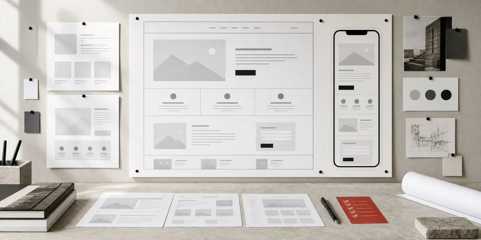
Open the page on a phone, not only in a resized desktop browser. Read the headline. Find the primary action. Check the proof. Try the enquiry route. Then ask whether the sequence still makes sense when the page becomes a vertical stack.
- The headline and first action appear before the visitor has to navigate around the page.
- Images and diagrams support the message without pushing the useful content too far down.
- Buttons and form fields are comfortable to use with a thumb.
- The page does not rely on hover, tiny text, or a desktop-only interaction.
A mobile page does not need to be a smaller copy of the desktop page. It needs to preserve the decision. Clarity, proof, and route still have to arrive in the right order.
We run this exact checklist on our own work. It is the same structure behind Park's College's 200+ page site, still generating admissions enquiries seven years after launch.
That is the practical standard for a website: not whether it looked complete when it launched, but whether it continues to help people make a decision years later.
If two or more items fail, that is the priority list for your next website conversation, not the redesign brief. See how Exposure approaches Digital Growth Solutions as part of a working brand system.
Run the checklist, then send us the results.
A redesign may eventually be the right answer. Start by knowing which decision the redesign has to improve.