Case Study · Agribusiness · Poultry feed · Project · Full brand engineering
MOHA Feeds
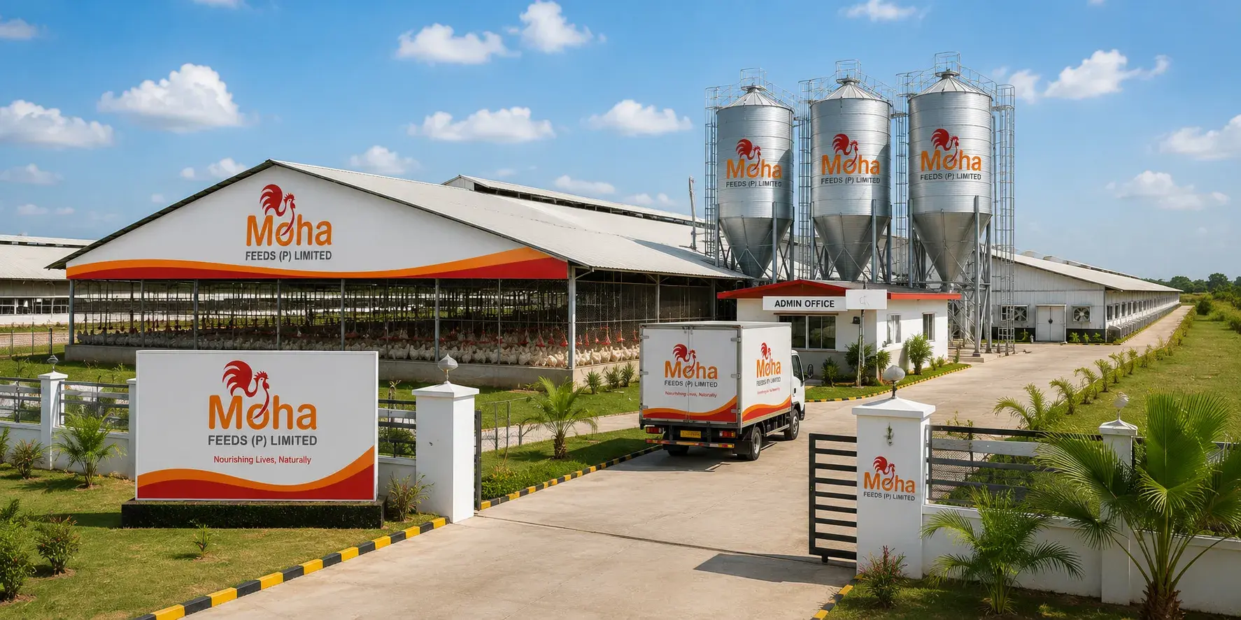
MOHA Feeds Private Limited - poultry feed mill, Velayuthampalayam, Avinashi, Tiruppur District, Tamil Nadu
A poultry feed business engineered from the mark up - rooster identity, the full stationery system, the daily record form the farm runs on, mill and farm signage, fleet livery, merchandise, and the launch creative for the September 2025 feed-mill opening.
2025
Feed mill opened · September
Full
Brand system · mark to mill
01
Rooster mark, one promise
2
Languages · English & Tamil
The brief
§01 / Brief
MOHA Feeds is a new poultry feed mill near Avinashi, built by an operator already inside the poultry business through MOHA Poultry Farms. A feed brand sells to farmers, and farmers buy on trust before price: clean feed, consistent grade, a name they can hold accountable. The brief was to engineer the whole brand before the mill opened - a mark that reads at farm-gate distance, the stationery and operational print a feed business runs on, signage across the mill and farms, fleet livery, and every piece of launch creative for the inauguration in September 2025.
The relationship
§02 / Relationship
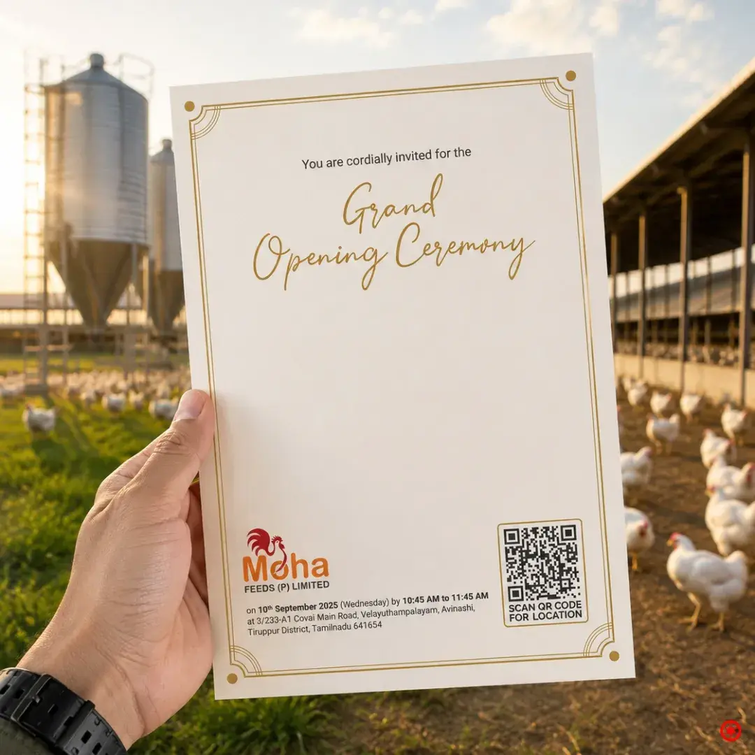
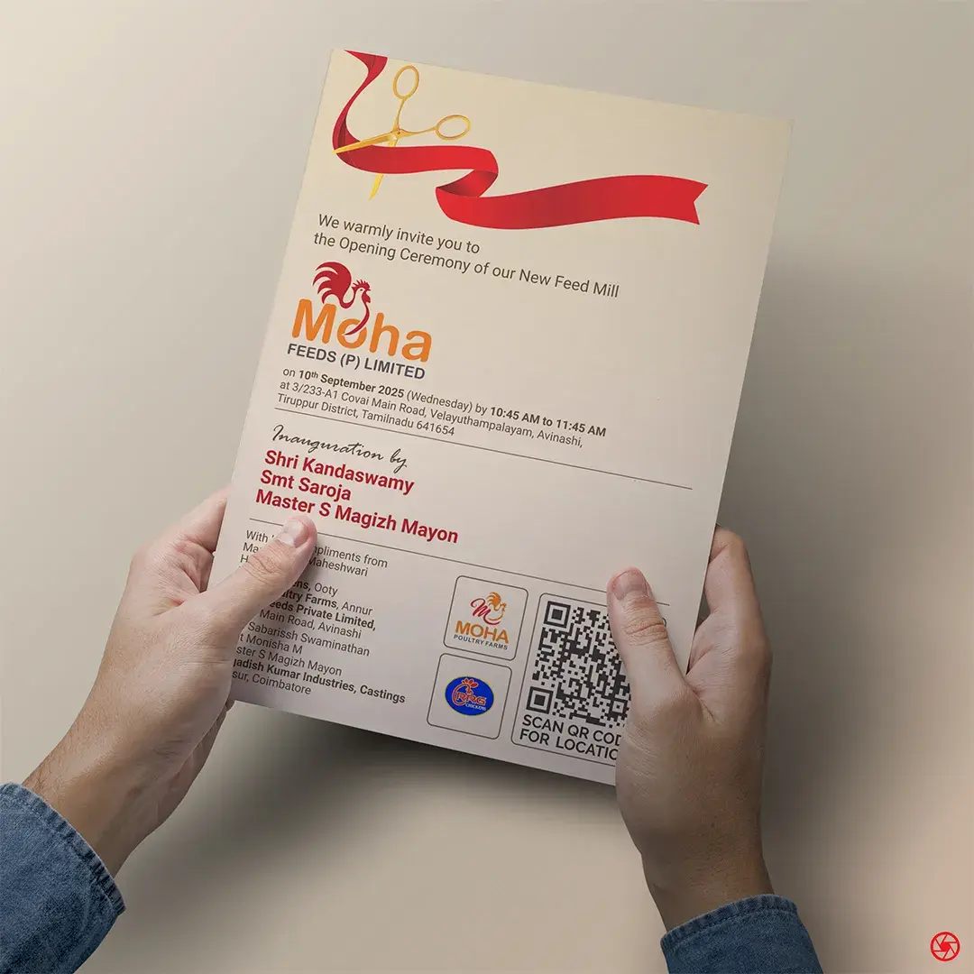
The engagement was a project, executed end-to-end ahead of the New Feed Mill opening ceremony on 10 September 2025 at Covai Main Road, Velayuthampalayam. Naming lockup and the rooster identity. The full stationery system, set to one address rule. The Poultry Farm Daily Record Form the farm fills in every day. Environmental signage from the mill fascia to the three feed silos, the gate boards, and the approach-road billboard. Vehicle livery on the delivery truck. Uniforms, caps, mugs, and tote bags. The grand-opening invitation, and the Tamil Pongal greeting that followed. One mark, one promise, deployed across every surface a feed business meets a farmer on.
The mark
A rooster, made to work at farm-gate distance.
A feed mark is read from a moving truck, a silo, a gate board, and a 2cm cap badge. The MOHA rooster is drawn to survive all four. Every part of it earns its place against the no-nonsense world of a working poultry farm.
- 01
The rooster, mid-crow
Poultry stated plainly, drawn in comb red. The crow reads as dawn and vigour - the hours a feed business actually keeps.
- 02
Neck into the wordmark
The rooster's neck dips into the Moha wordmark so the symbol and the name lock as one unit and never drift apart across applications.
- 03
Comb red to feed orange
Red for the comb and energy, orange for grain and warmth. The two-colour shift signals appetite and health without a line of copy.
- 04
The sweep curve
An orange-to-red curve, half furrow and half horizon, repeated along the base of every artefact as the brand's quiet signature.
The work, in parts
§03 / Scope of engagement
01
The rooster mark
A rooster drawn mid-crow in comb red, its neck flowing into the orange Moha wordmark so symbol and name read as one lockup. Poultry made literal, at any size from a cap badge to a silo.
02
Colour and the sweep
Comb red and feed orange, with a single orange-to-red sweep curve as the recurring device. It runs along the foot of the card, the mug, the billboard, and the truck, tying the system together.
03
Tagline
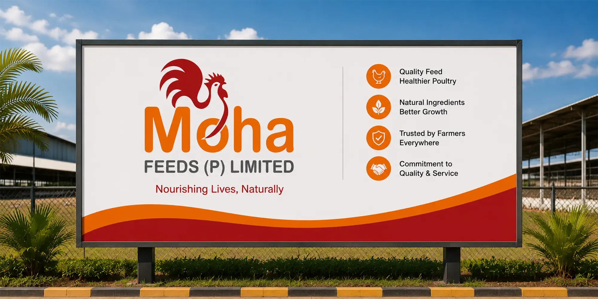
Nourishing Lives, Naturally. A feed business stated as a promise, carried on the signage, the billboard, and the farm boards.
04
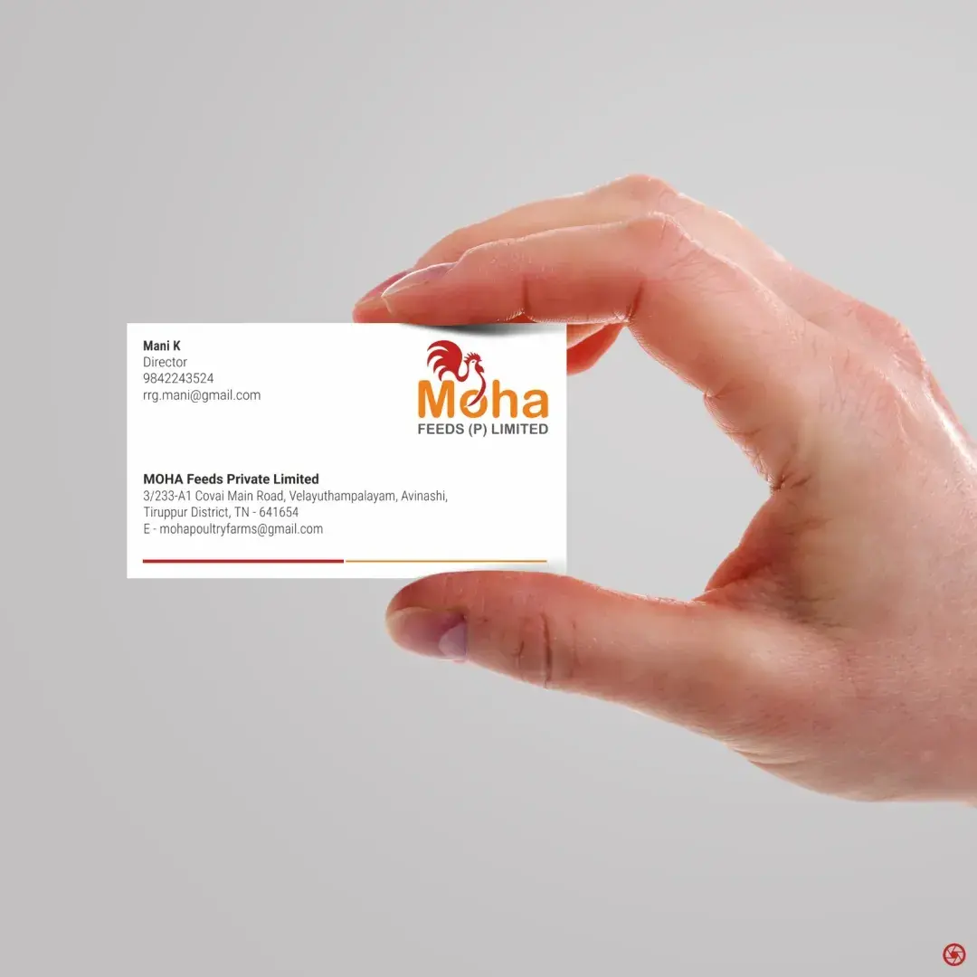
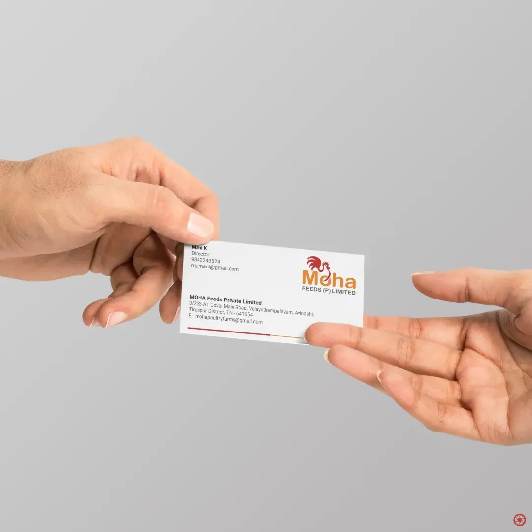
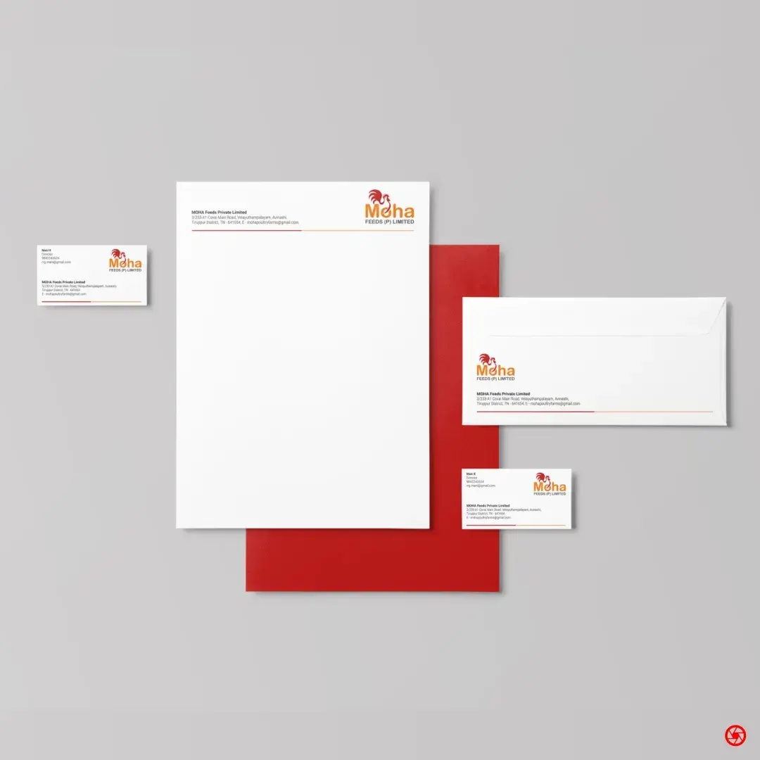
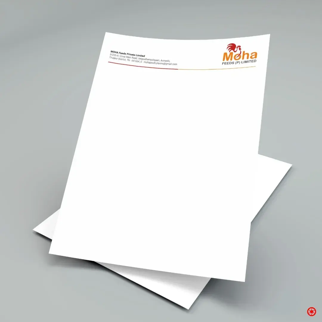
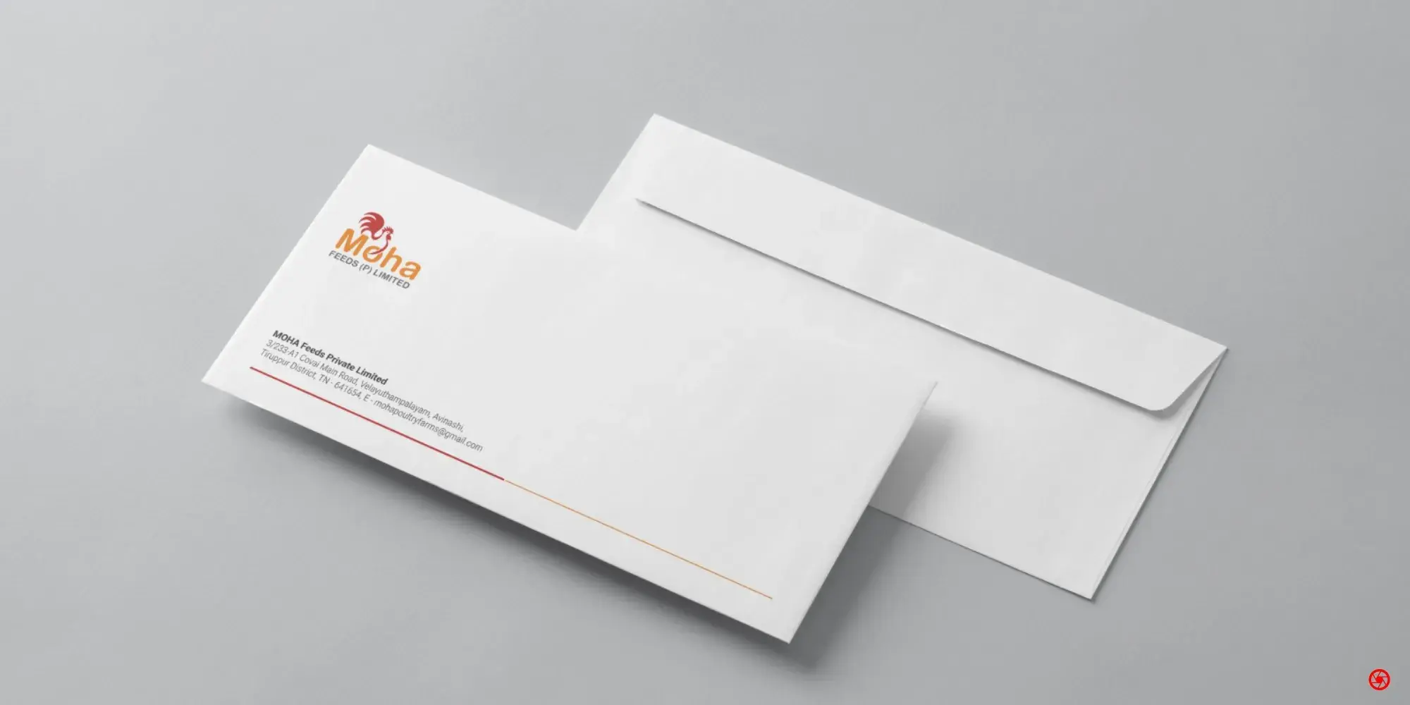
Stationery system
Business card, letterhead, and envelope set to one address rule and one sweep. The director's card and the company card share a single grid.
05
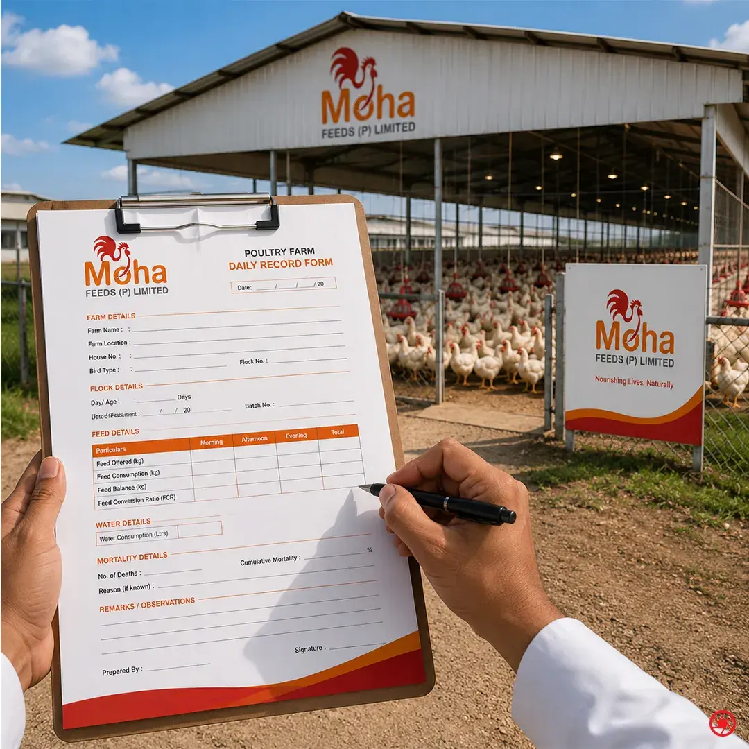
Operational print
The Poultry Farm Daily Record Form - feed offered, consumption, balance, FCR, water, mortality, remarks. The brand applied to the document the farm actually runs on, not just the ones it hands out.
06
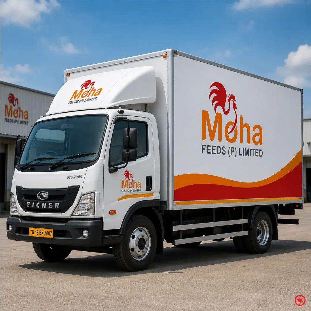
Environment and fleet
Mill fascia, three branded feed silos, gate boards, and a roadside billboard carrying the four pillars. The delivery truck liveried front and box so the mark travels the district.
07
Launch and festive creative
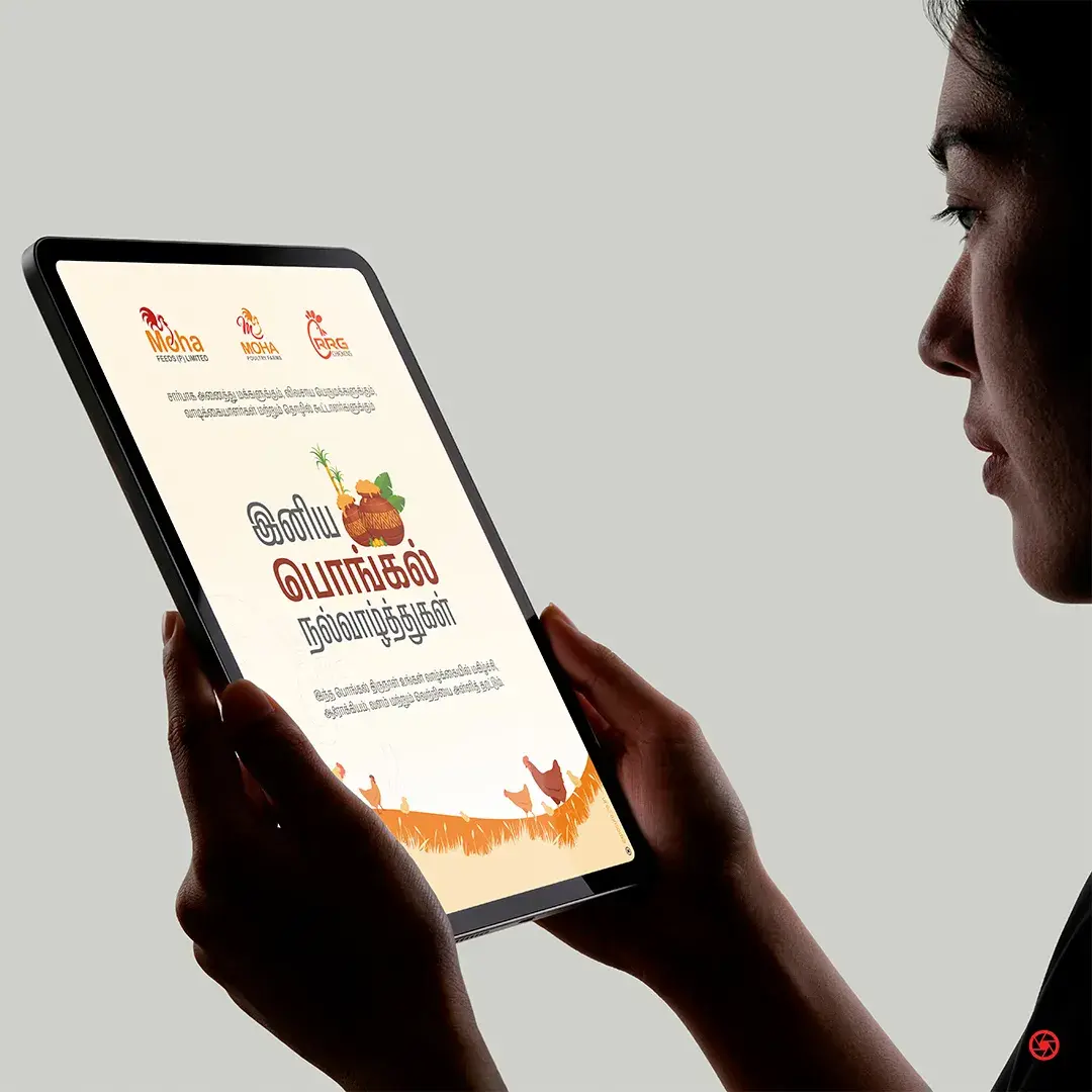
The grand-opening invitation for the feed-mill inauguration, and a Tamil Pongal greeting taking the same brand voice into the first festival after launch.
The work, in pieces
From the crest to the merchandise.
A selection from 2025–2025. Every artefact derived from one master visual system.
Scope of engagement
One brand system,
across 23 categories.
- Naming lockup
- Rooster brand mark
- Wordmark (English)
- Brand colour system (red + orange)
- Sweep graphic device
- Nourishing Lives, Naturally tagline
- Brand pillars
- Business cards
- Letterhead
- Envelope
- Stationery system
- Poultry Farm Daily Record Form
- Mill fascia signage
- Feed silo branding
- Gate and farm boards
- Roadside billboard
- Vehicle livery · delivery truck
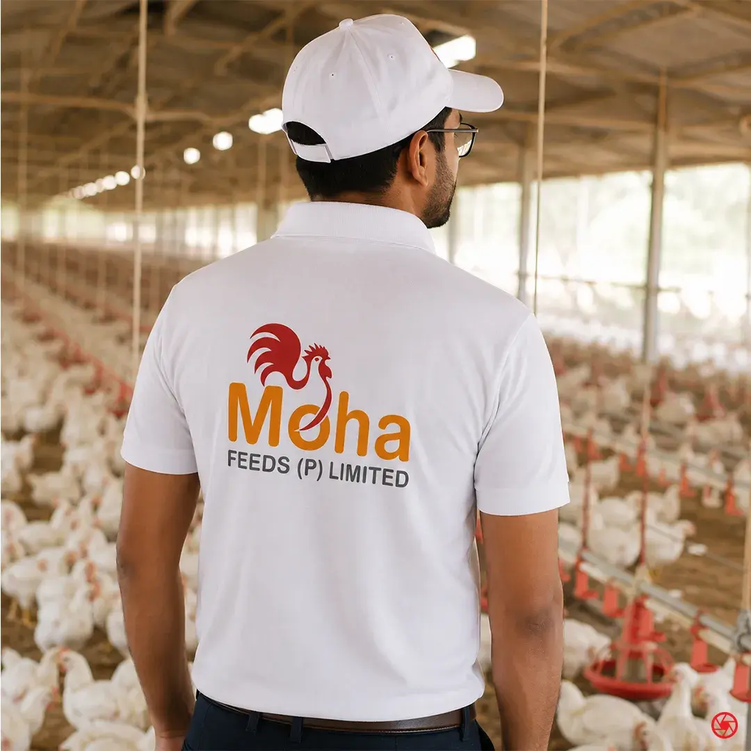
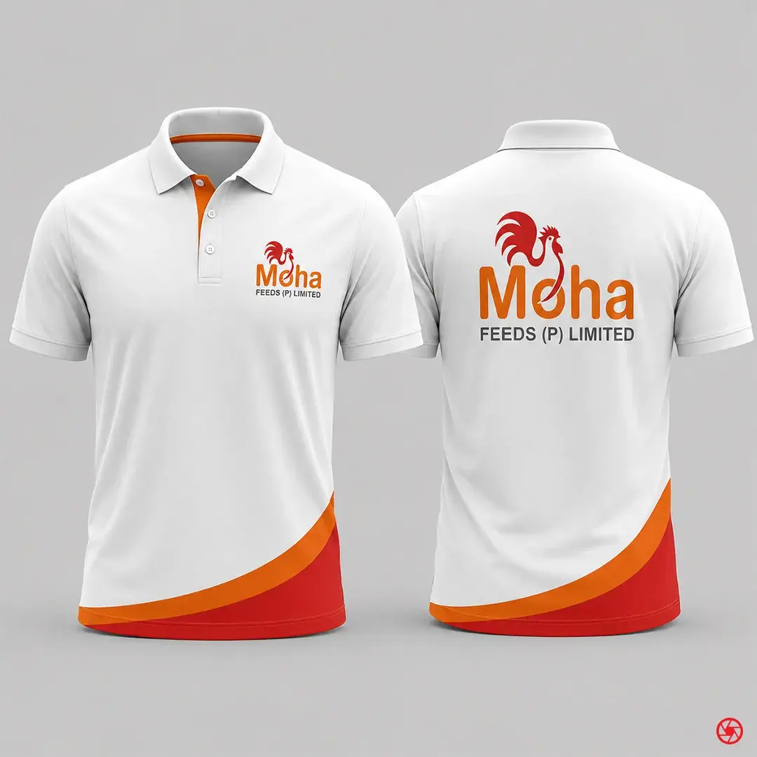
- Staff uniform & cap
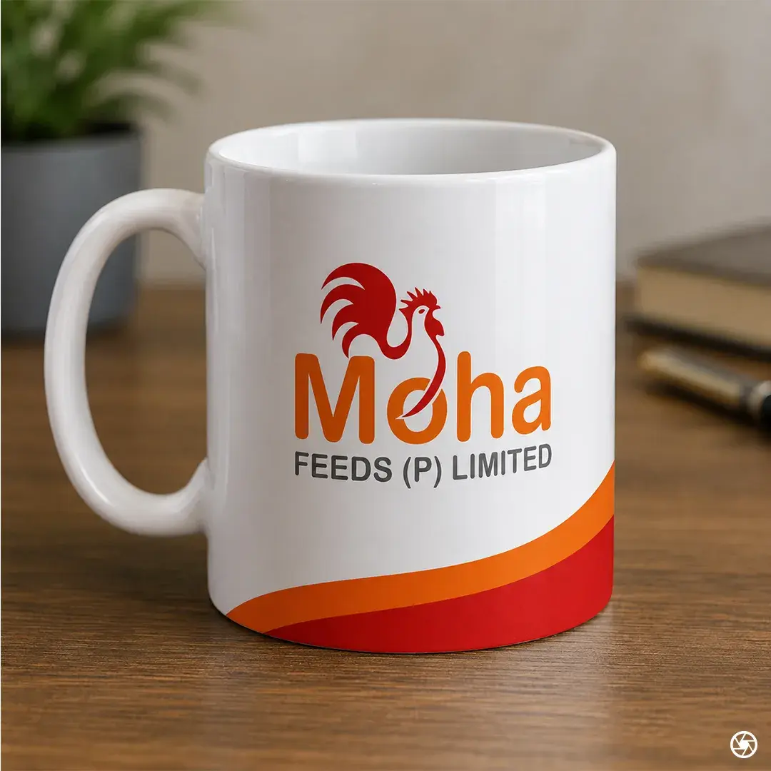
- Branded mug
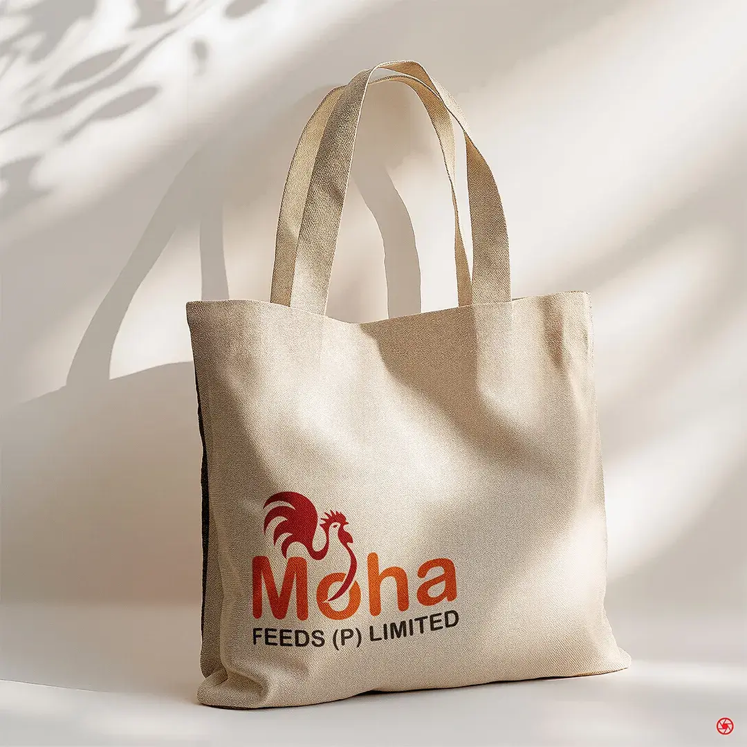
- Canvas tote bag
- Grand opening invitation
- Feed-mill inauguration invite
- Festive creative (Tamil Pongal)
“A feed brand earns trust before it earns the order. We built the mark, the mill signage, and the daily form to all say the same thing.”
Ready when you are
Send us a brief.
We respond in 24 hours.
Complete the Discovery Workshop (guided steps built around the service you need) and our principal team will come back with a call slot, an honest assessment, and a clear first step. No standard pitch, no generic decks.
Discovery Workshop
Guided by service. Built for your brief.
Service-specific questions, not a generic enquiry form. Takes 5 to 10 minutes.
- 01
Pick your service
Logo, website, packaging, or implementation. Select one or more and the brief builds around exactly what you need.
- 02
Choose how to work together
A fixed-scope project or ongoing monthly support. One choice and the form adapts to your model.
- 03
Brief us on your business
Industry, style direction, competitors, and the specifics per service selected. The more detail, the sharper our response.
- 04
We reply within 24 hours
A call from our principal team, not a queue. An honest read of your brief and a clear first step forward.
Or email us directly at info@exposure.co.in