Case Study · B2B · Water and environmental engineering · Brand identity · Visual system & manual
BlueCo 360
Integrated water, wastewater and environmental engineering
A documented identity system for an integrated water, wastewater and environmental engineering brand, from the water-drop mark to a 32-page manual and a suite of application visualizations.
32pp
Brand identity manual
The brief
§01 / Brief
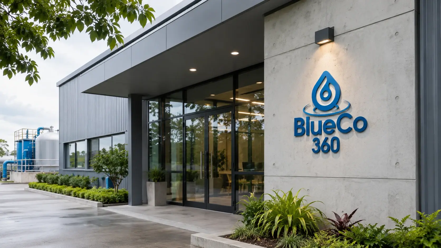
BlueCo 360 is an integrated water, wastewater and environmental engineering brand. Its manual defines a clear promise for a technically complex field: reliable water, smarter solutions, lasting support. The identity needed to communicate engineering capability, dependable systems and responsible performance across the brand’s corporate and operational touchpoints.
The relationship
§02 / Relationship
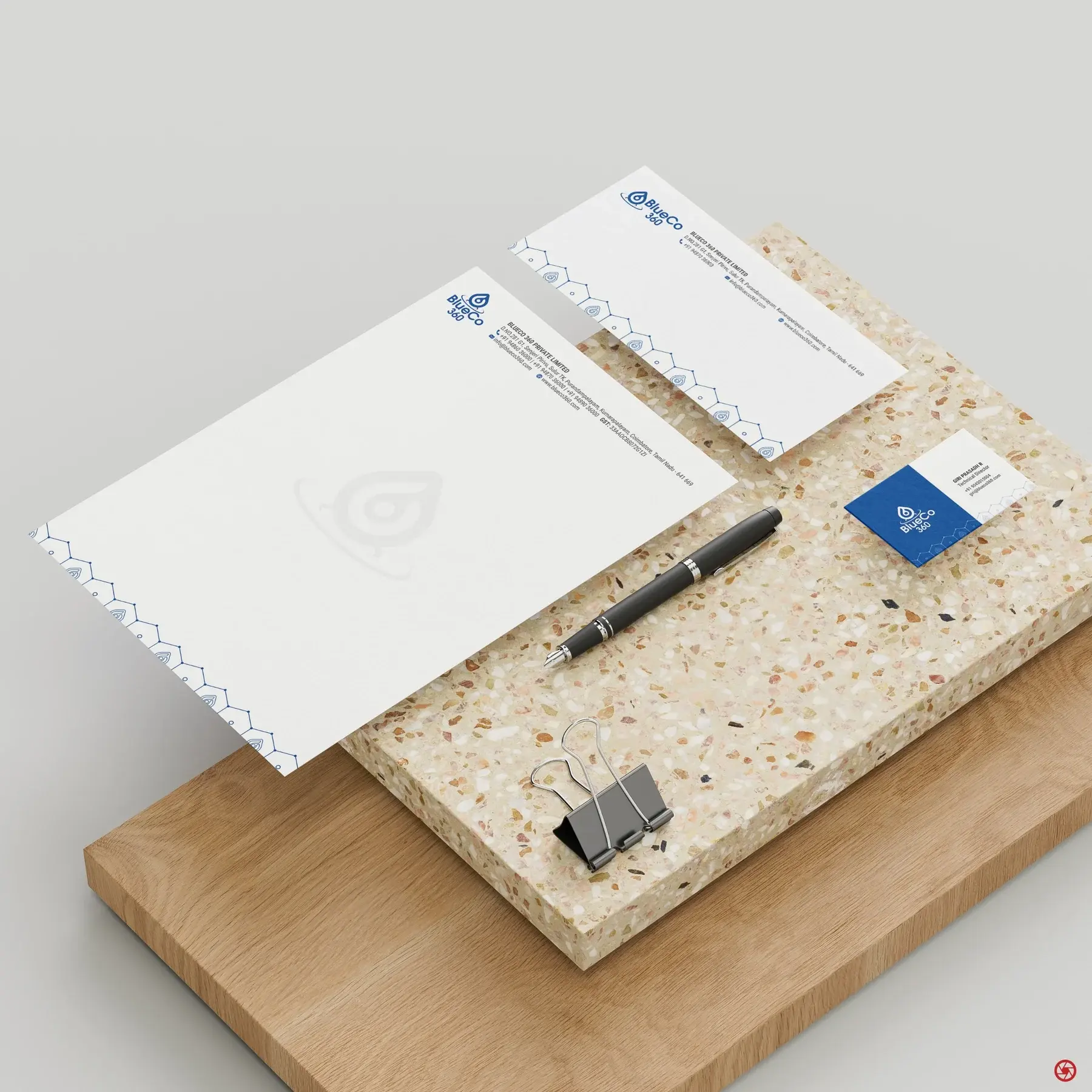
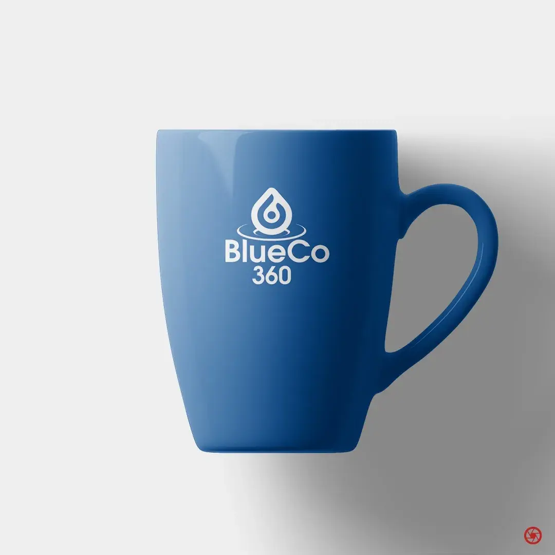
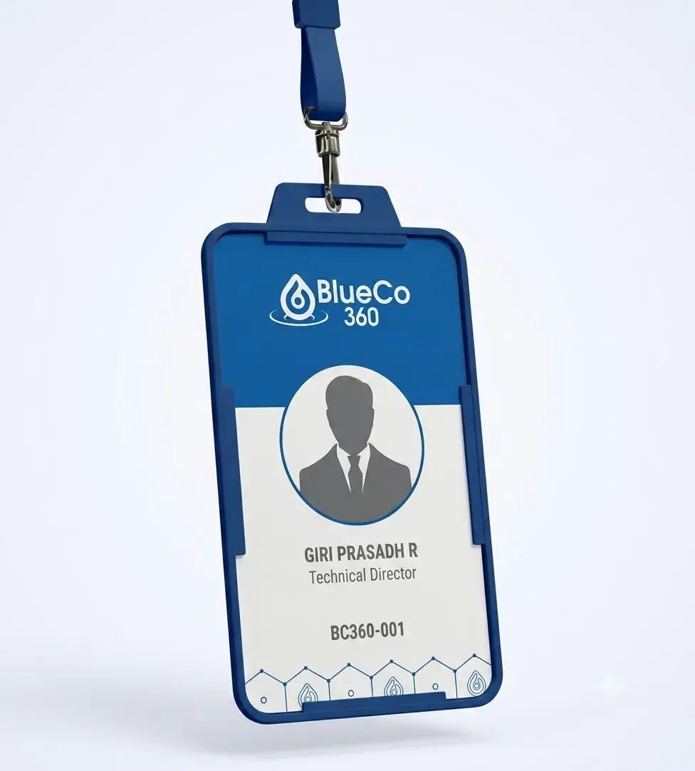
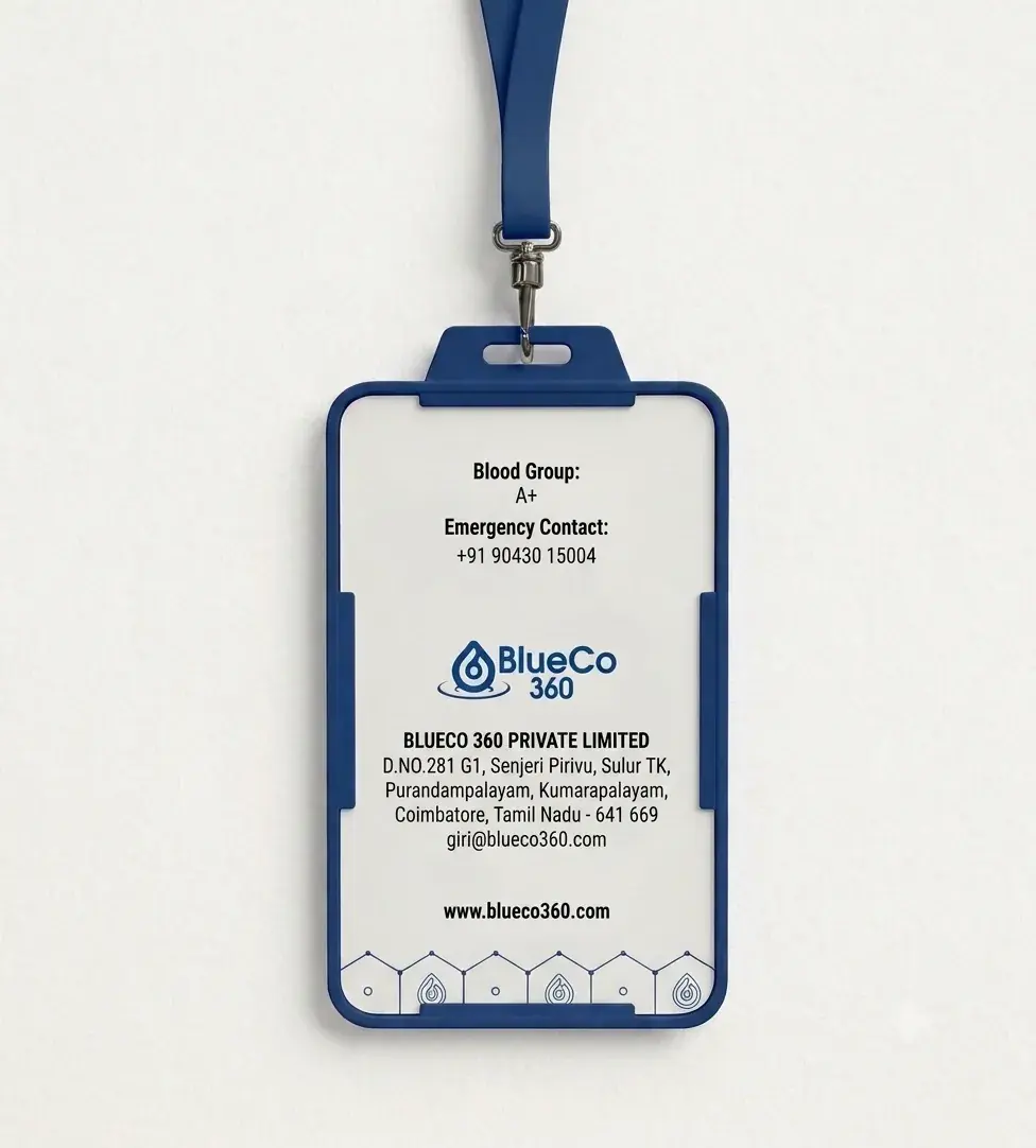
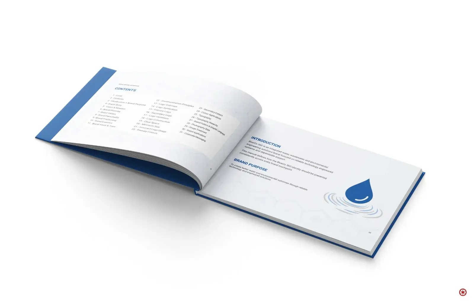
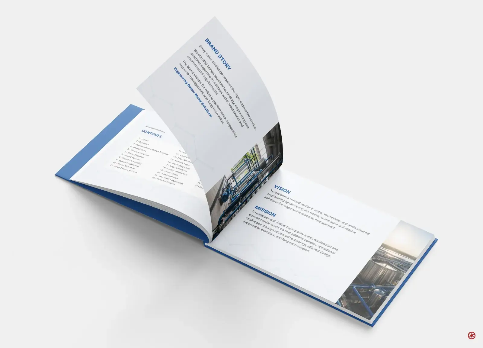
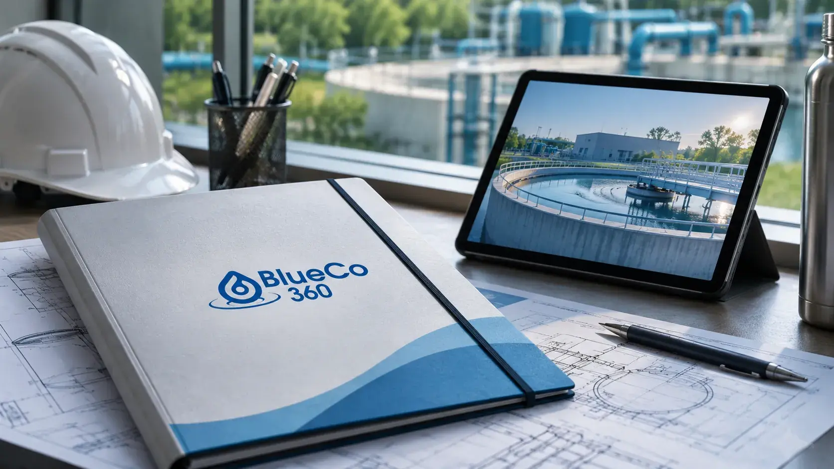
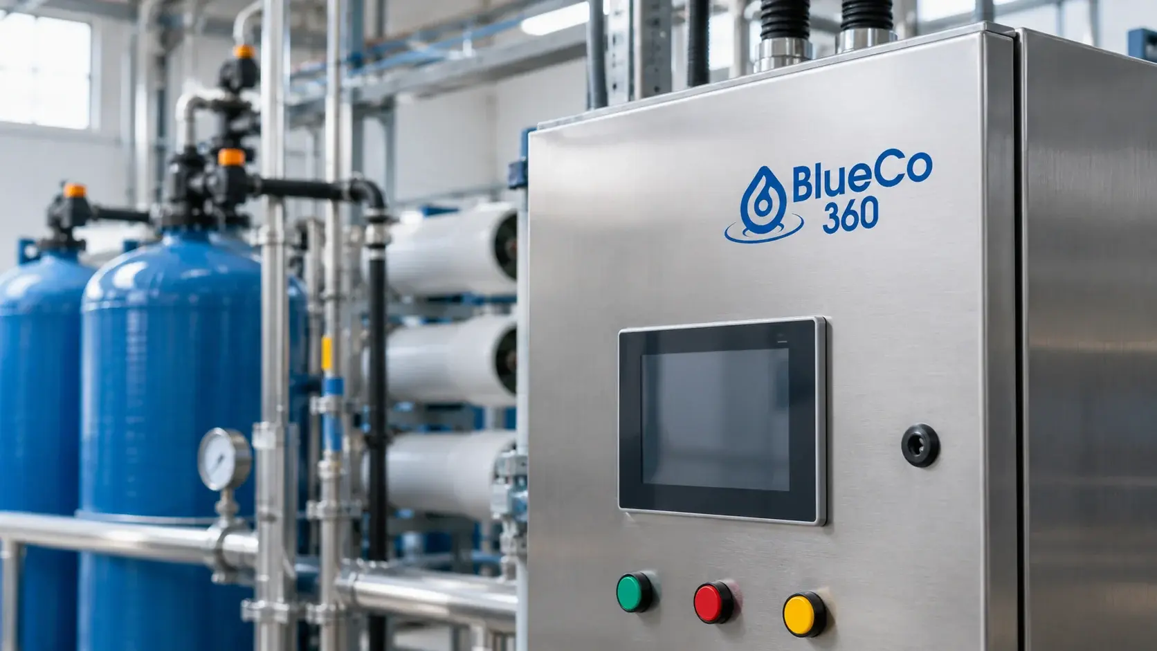
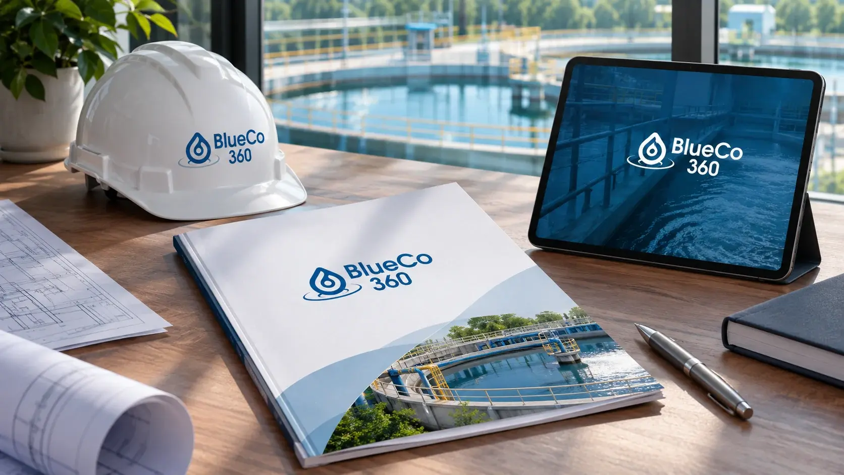
The work establishes the brand purpose, vision, mission, values, personality, positioning and communication principles, then codifies the identity in a 32-page manual. The system covers the water-drop mark and its construction, logo variations, colour and typography, a supporting pattern, image direction and corporate applications. The supplied mockups and films show selected ways the identity can extend into stationery, staff identification, industrial controls, environments and motion. These application scenes are design visualizations, not records of installed work.
The mark
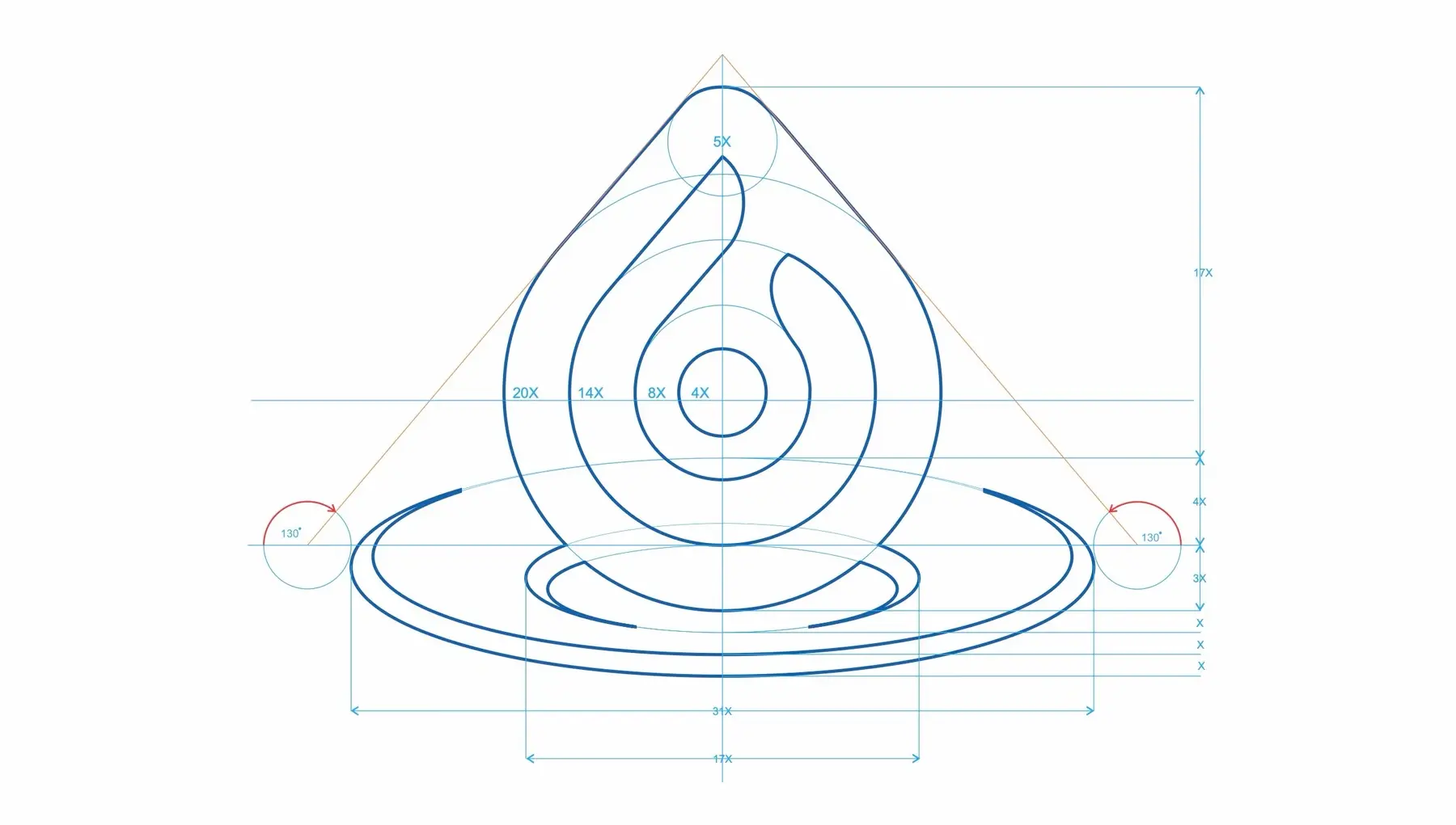
A drop, held in a system of flow.
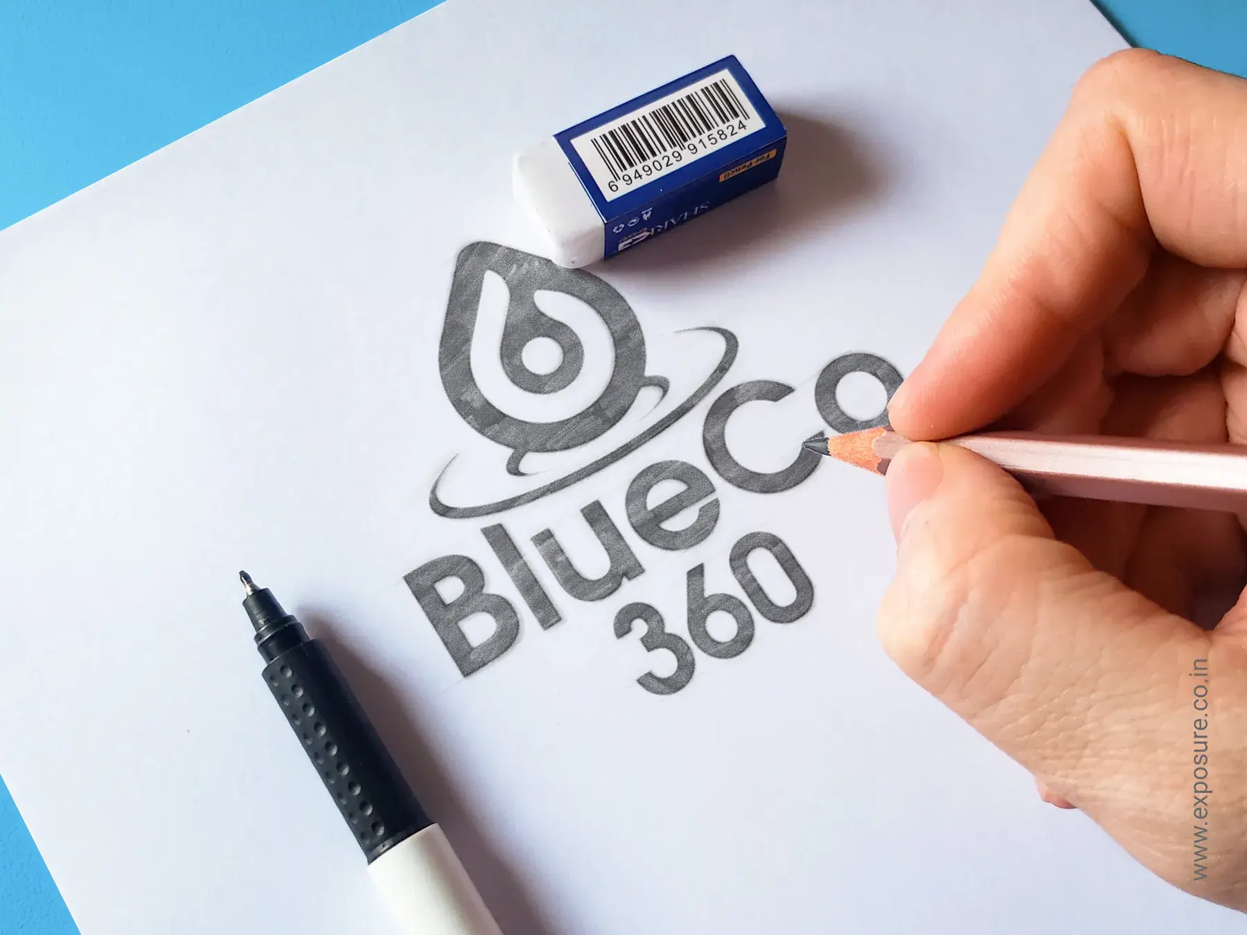
The mark brings the company’s category and engineering character together. A water drop anchors the identity in water treatment; the internal flow and surrounding ripples suggest managed movement and solutions that extend beyond a single point of use.
- 01
Water droplet
The category anchor: water, purity, treatment and resource management.
- 02
Inner flow
Controlled movement through engineered treatment systems.
- 03
Circular core
Continuity, reliability and the completeness of the 360° idea.
- 04
Water ripples
Flow, reach and the wider impact of integrated solutions.
The work, in parts
§03 / Scope of engagement
01
Positioning
“Engineering Better Water Solutions.” The manual positions BlueCo 360 around reliable technology, responsible resource management and long-term performance.
02
The water-drop mark
The drop makes the category immediately recognizable. Its inner flow represents controlled movement and treatment, while the circular core and ripples connect the mark to continuity, flow and integrated solutions.
03
Colour system
BlueCo Blue carries water, trust, technology and reliability. Deep navy, light blue, cool grey and white provide supporting roles for technical and corporate communication.
04
Typography
Roboto Bold, Medium and Regular establish a consistent hierarchy. Arial is specified as a supporting typeface for technical documents, data tables and digital interfaces.
05
Graphic language
A repeating pattern combines a hexagonal engineering grid with the water mark and ripple forms, extending the identity beyond the logo while keeping it recognizable.
06
Brand manual
The 32-page guide records logo use, clear space, minimum sizes, colour, typography, photography, applications and corporate messaging for consistent future use.
Applications, by design
One identity across the system.
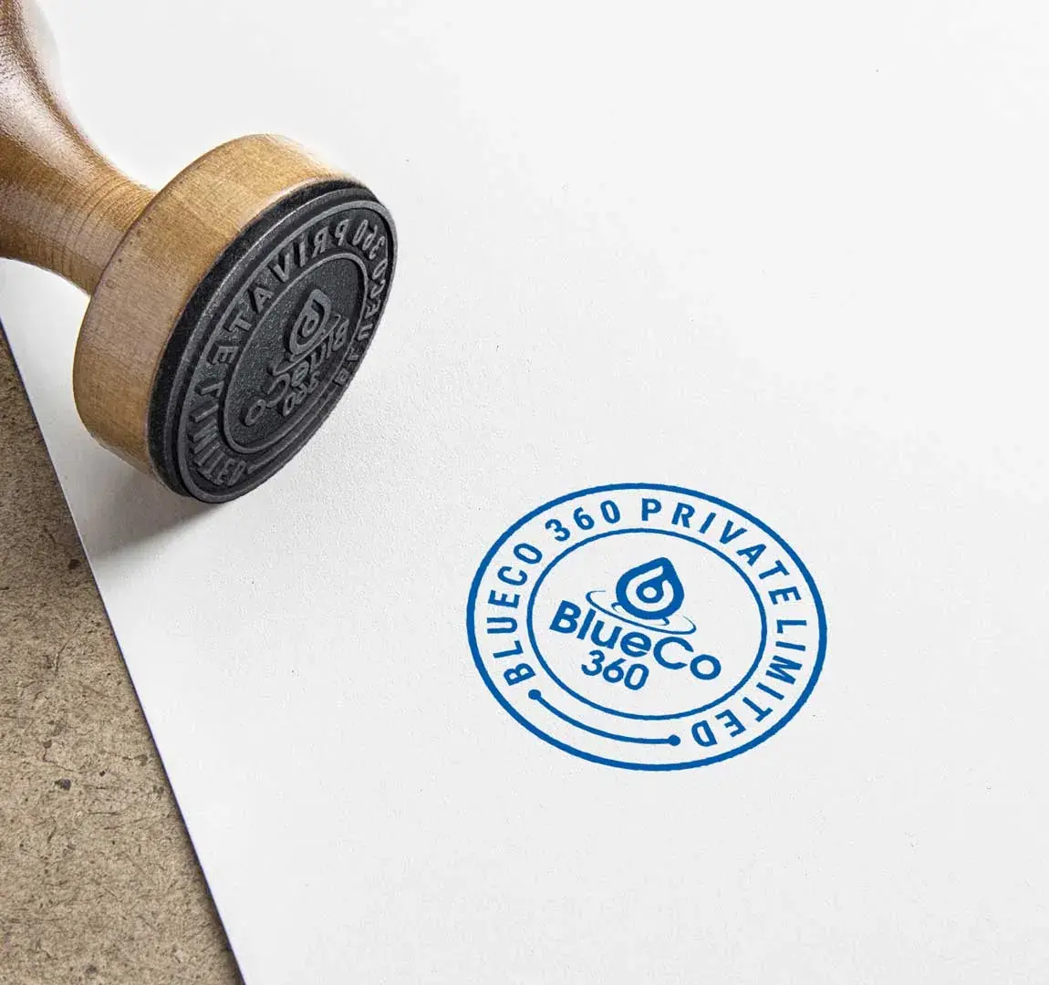
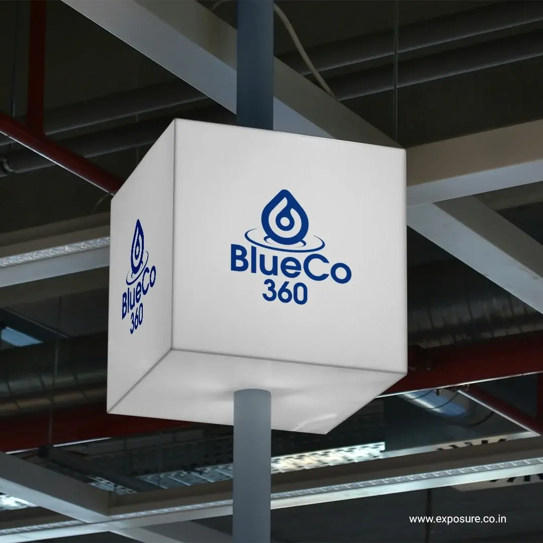
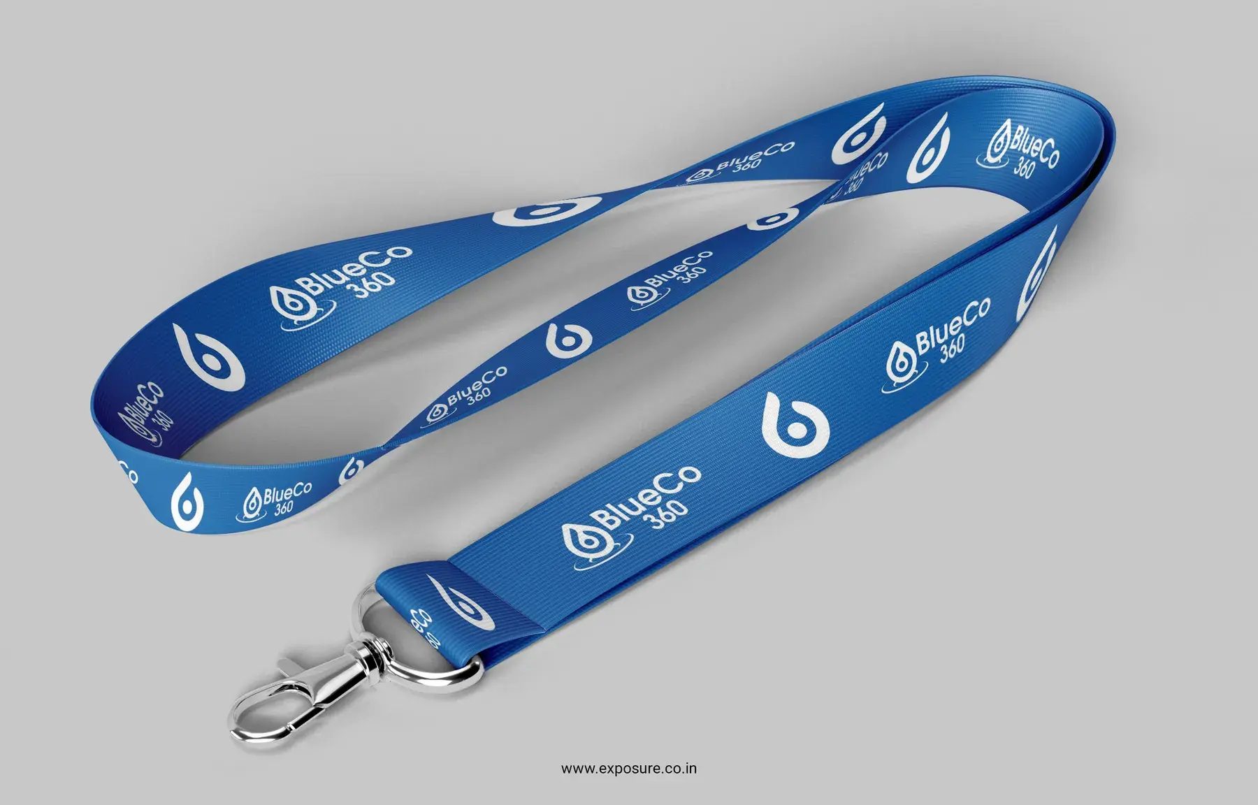
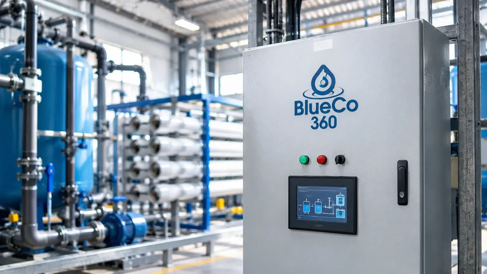
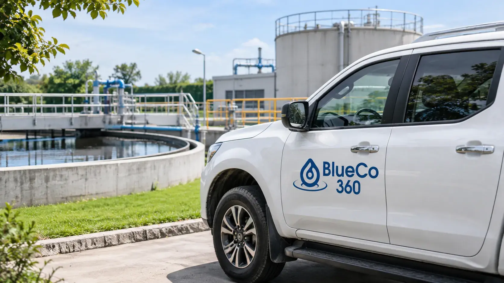
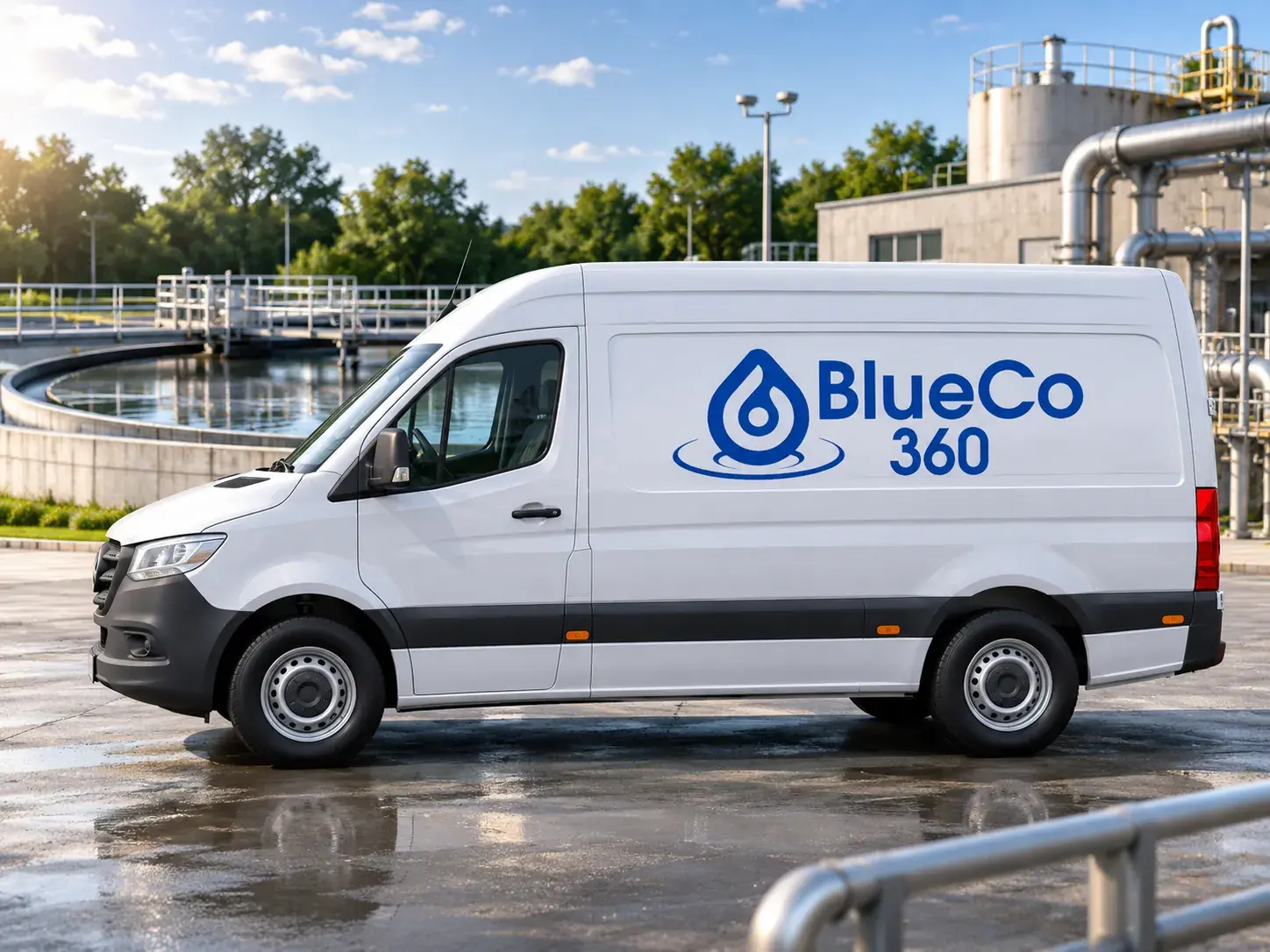
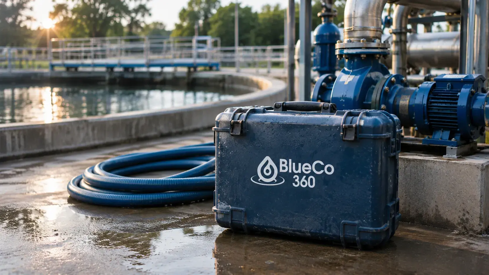
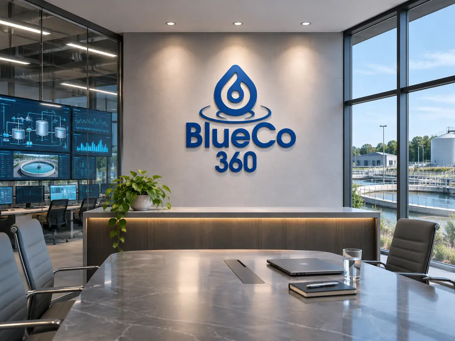
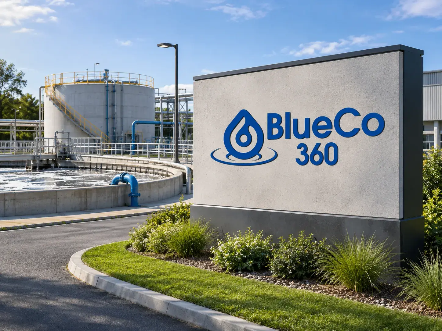
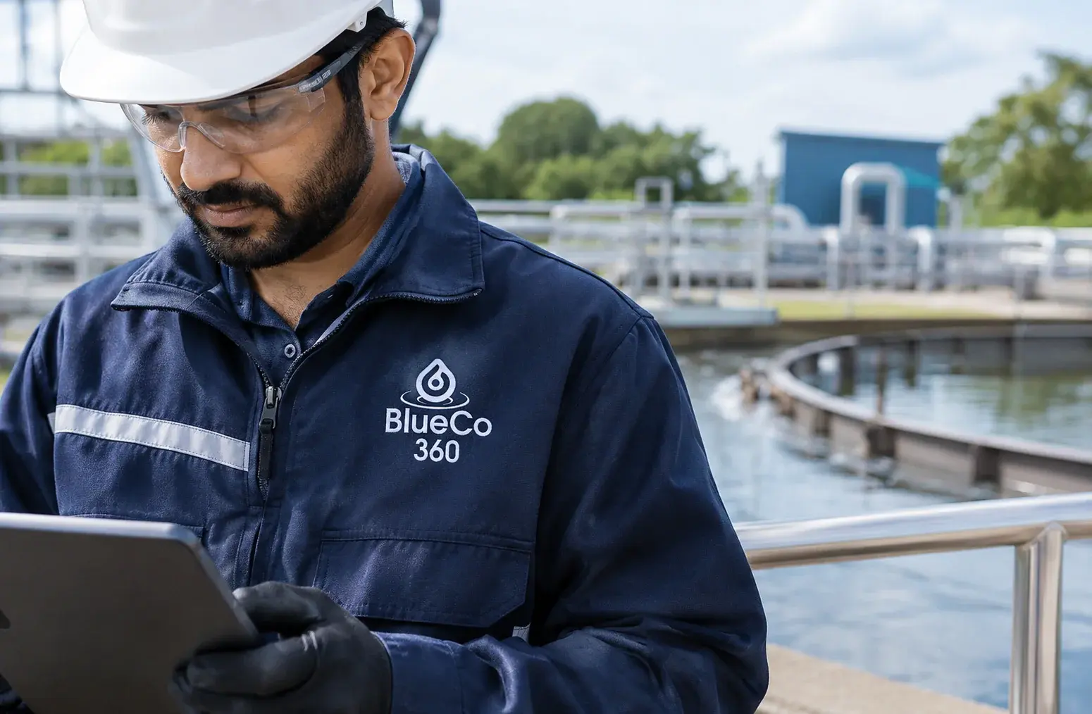
Selected design visualizations trace the identity from corporate collateral and staff identification to industrial systems, vehicles and environmental signage. Mockups are illustrative, not records of installed work.

Identity in motion
The mark, made kinetic.
Three short films explore the BlueCo 360 identity, from its water-led reveal to its use across a corporate brand world.
Corporate brand showcase
A short brand film showing BlueCo 360 identity visualizations across industrial and corporate applications.
Logo reveal
A water-inspired reveal sequence for the BlueCo 360 mark.
Logo animation guide
A motion study demonstrating the BlueCo 360 logo animation.
Scope of engagement
One brand system,
across 10 categories.
- Brand purpose and positioning
- Brand identity
- Logo construction and variations
- Colour system
- Typography
- Graphic pattern
- Photography direction
- 32-page brand manual
- Corporate applications
- Identity motion studies
Ready when you are
Send us a brief.
We respond in 24 hours.
Complete the Discovery Workshop (guided steps built around the service you need) and our principal team will come back with a call slot, an honest assessment, and a clear first step. No standard pitch, no generic decks.
Discovery Workshop
Guided by service. Built for your brief.
Service-specific questions, not a generic enquiry form. Takes 5 to 10 minutes.
- 01
Pick your service
Logo, website, packaging, or implementation. Select one or more and the brief builds around exactly what you need.
- 02
Choose how to work together
A fixed-scope project or ongoing monthly support. One choice and the form adapts to your model.
- 03
Brief us on your business
Industry, style direction, competitors, and the specifics per service selected. The more detail, the sharper our response.
- 04
We reply within 24 hours
A call from our principal team, not a queue. An honest read of your brief and a clear first step forward.
Or email us directly at info@exposure.co.in