Case Study · Healthcare · Ayurveda · Project
Aashirwad Ayurveda (AVP Group)
Aashirwad Ayurveda Pharmacy India Private Limited - a unit of AVP Ayurveda, Coimbatore
One master mark rooted in the Tridosha - extended across a full pharmaceutical product line, print advertising, corporate documents, and a premium cosmetics sub-brand.
2019
Project year
3
Dosha marks
2
Brand expressions
AVP
Parent group
The brief
§01 / Brief
Aashirwad Ayurveda is a unit of AVP Ayurveda, one of the most respected names in classical Ayurvedic practice. It needed a master brand to span its full range - pharmaceutical-grade Kashayam and Choornam, modern health products, fumigative agents, corporate documents, and a premium cosmetics line, ORA. The challenge: hold the depth of the tradition while reading as contemporary trust on every shelf.
The relationship
§02 / Relationship
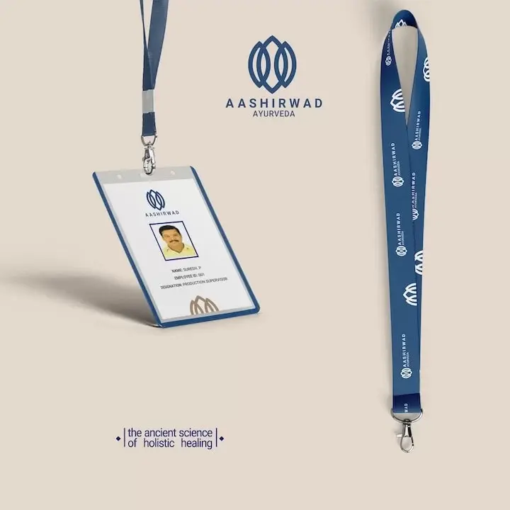
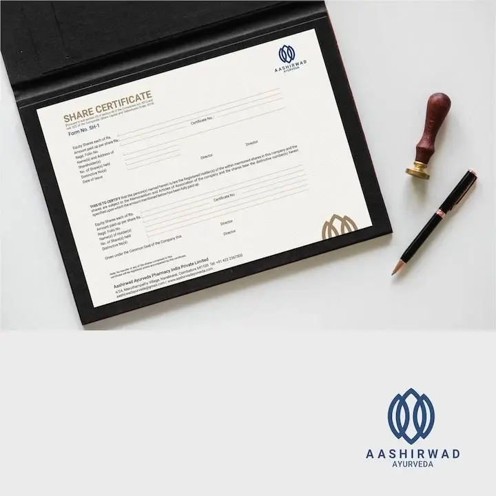
An identity-first engagement that grew to cover the full breadth of the company's output: master mark and symbol system, product packaging across the pharmaceutical and FMCG range, print advertising, staff ID and lanyard, corporate share certificate, and the ORA sub-brand - a standalone premium cosmetics marque sharing the Aashirwad heritage mark at its base.
The mark
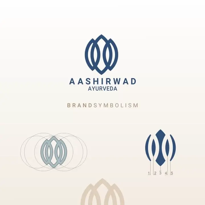
A mark drawn from the Tridosha.
Three leaves for three doshas. Overlapping mandalas for the flower of life. Five-unit spacing for five elements and five senses. The Aashirwad mark is a symbol system built from Ayurvedic doctrine - every proportion carries a rationale that exists independently of visual preference.
- 01
Three leaves
Vata, Pitta, and Kapha - the three universal life forces. Unequal proportions reflect the natural variation in the doshas: no two individuals hold the same balance.
- 02
Overlapping mandalas
The flower of life - a geometry of infinite cycles and creation, a structure found across traditions as the symbol of universal continuity.
- 03
Five-unit spacing
The five senses and five elements - Space, Air, Fire, Water, Earth - the elemental system that underlies all Ayurvedic diagnosis and treatment.
- 04
Deep navy blue
Emotional healing, inner peace, and meditative calm. A deliberate departure from the red-and-green convention of Indian pharmacy branding.
The work, in parts
§03 / Scope of engagement
01
The Tridosha mark
Three leaves for Vata, Pitta, and Kapha - drawn unequal to reflect natural variation. Overlapping mandalas at the centre for the flower of life. Five-unit spacing references five senses and five elements.
02
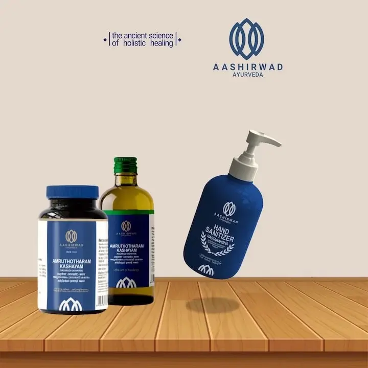
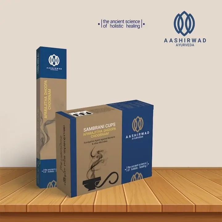
Palette - clinical calm
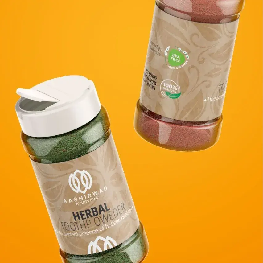
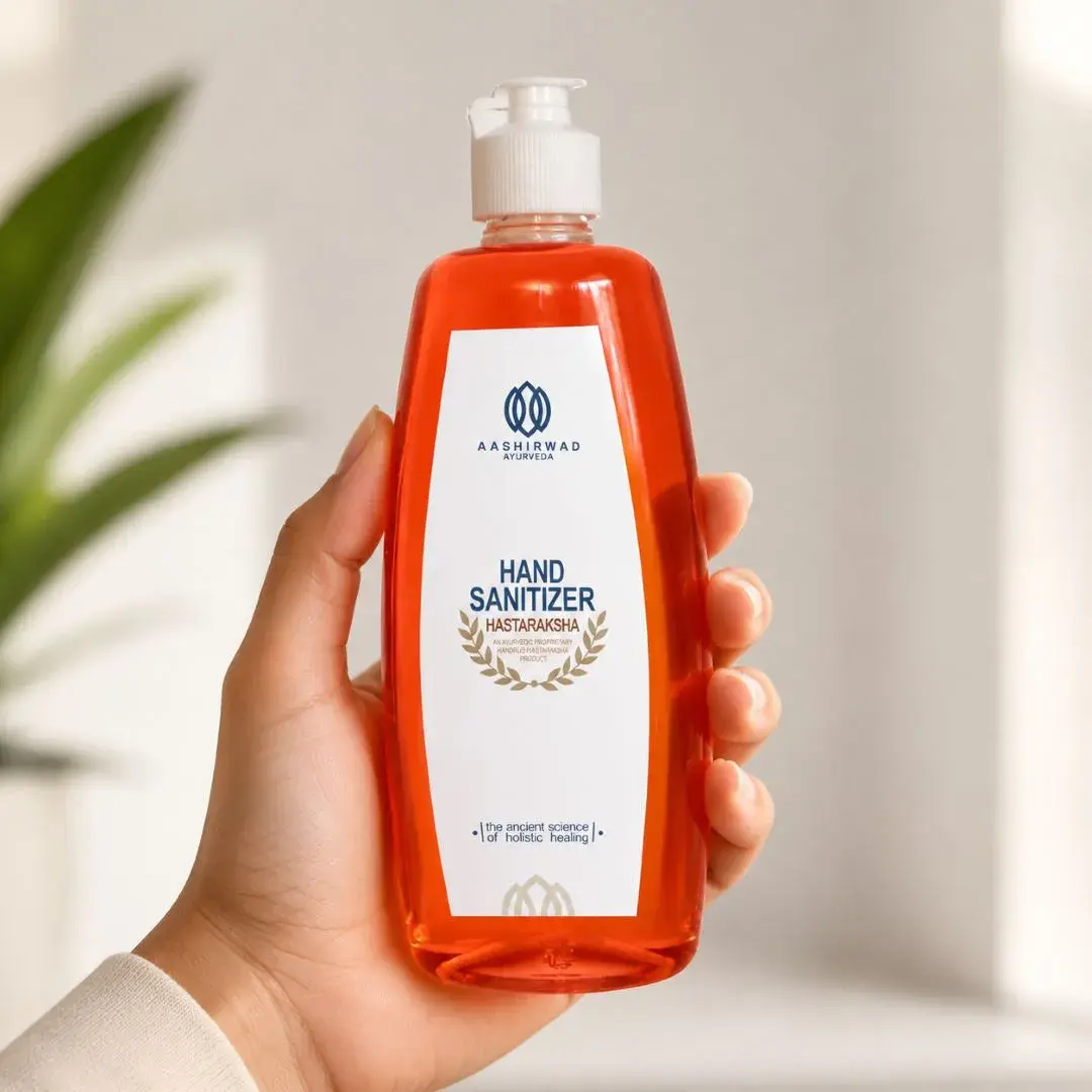
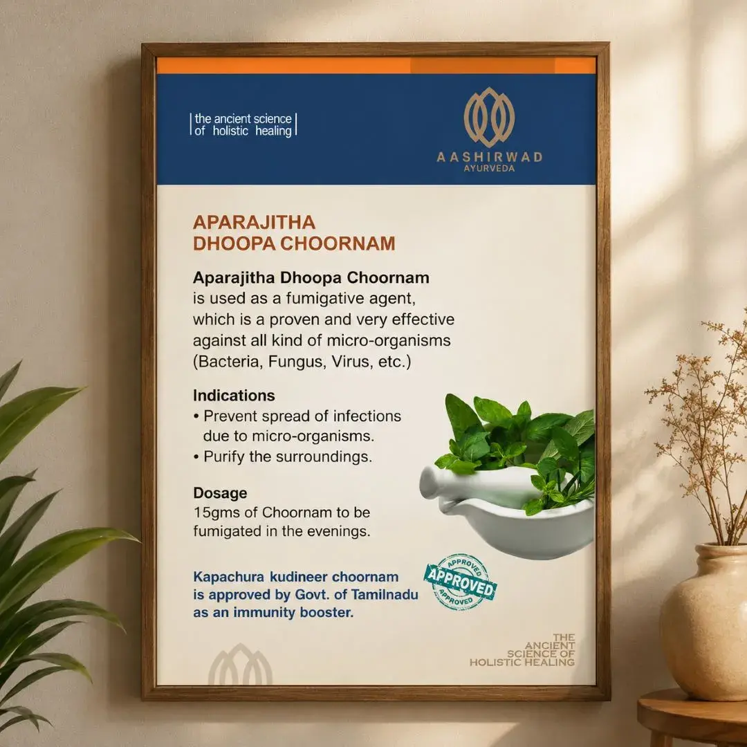
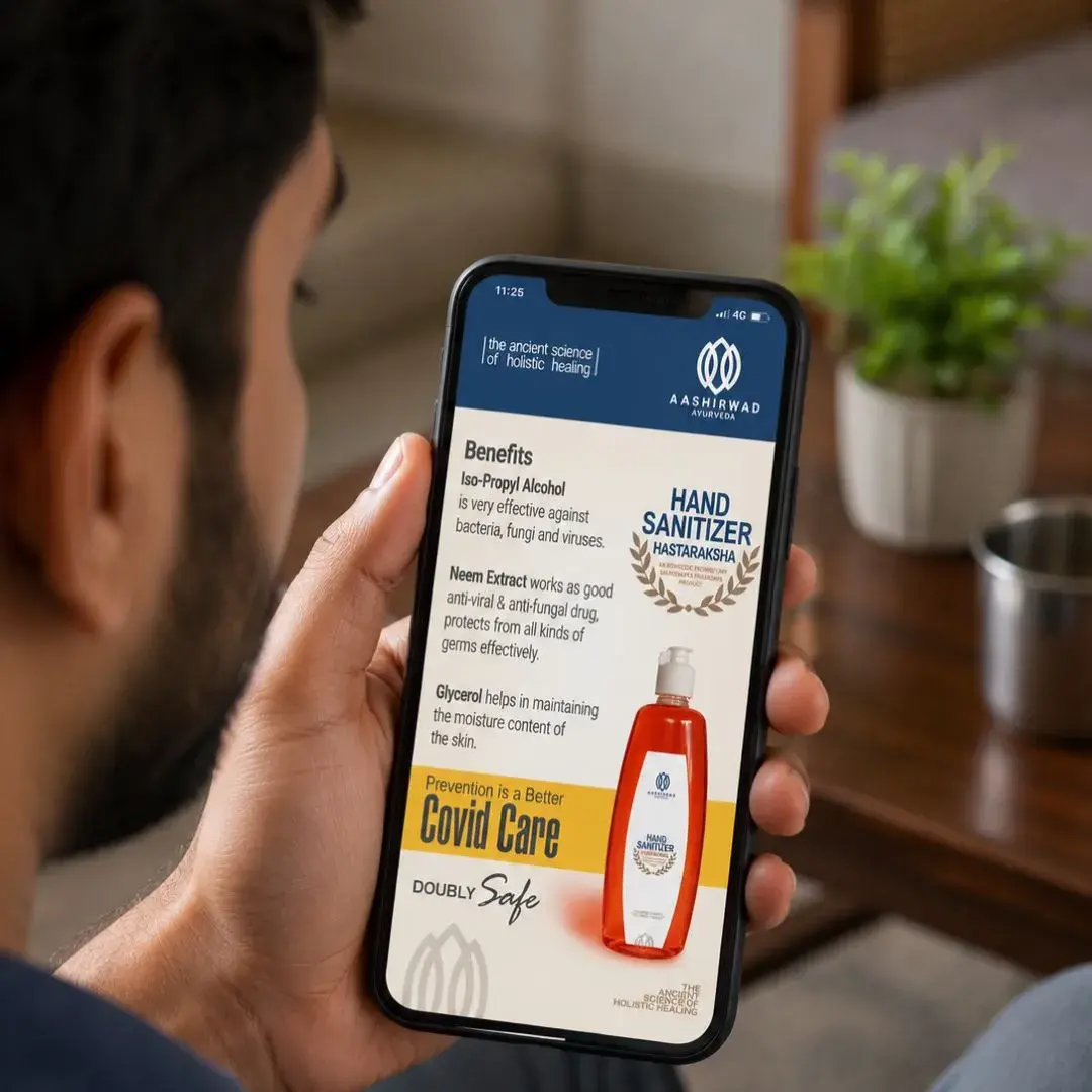
Deep navy against pale grounds - clinical trust without pharmaceutical coldness. Every product from Sambrani cups to Kashayam syrup holds the same calm authority.
03
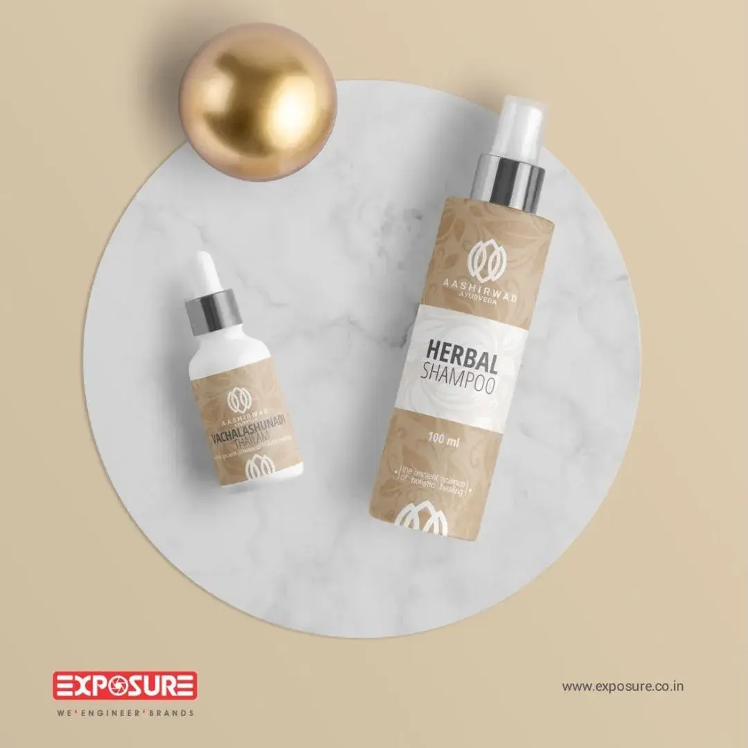
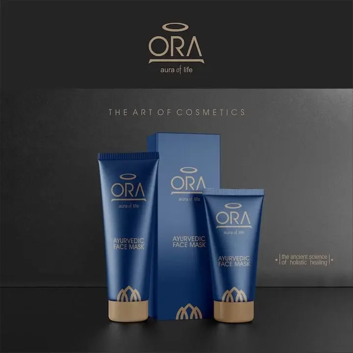
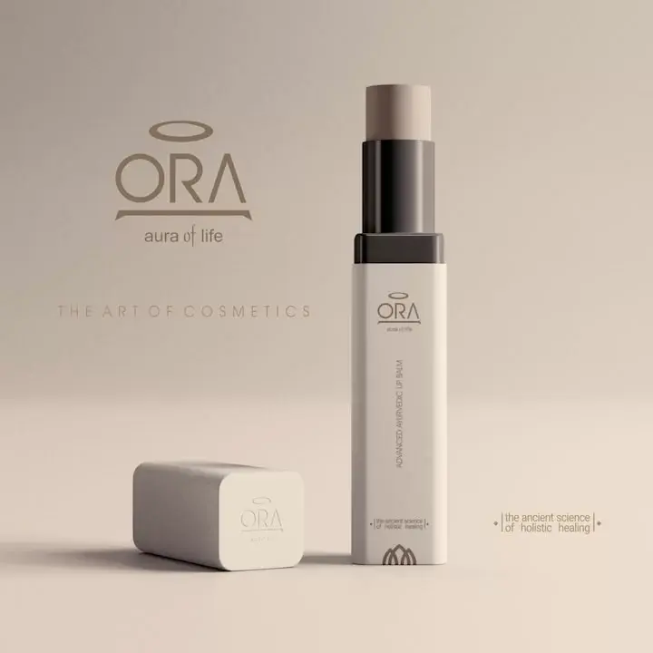
ORA - the sub-brand
A stand-alone premium cosmetics marque - wordmark-led, positioned around 'the art of cosmetics.' The Aashirwad tridosha seal at the base of each ORA pack. Two brands, one source.
The work, in pieces
From the crest to the merchandise.
A selection from 2019–2026. Every artefact derived from one master visual system.
Scope of engagement
One brand system,
across 7 categories.
- Brand Identity
- Logo Design
- Product Packaging
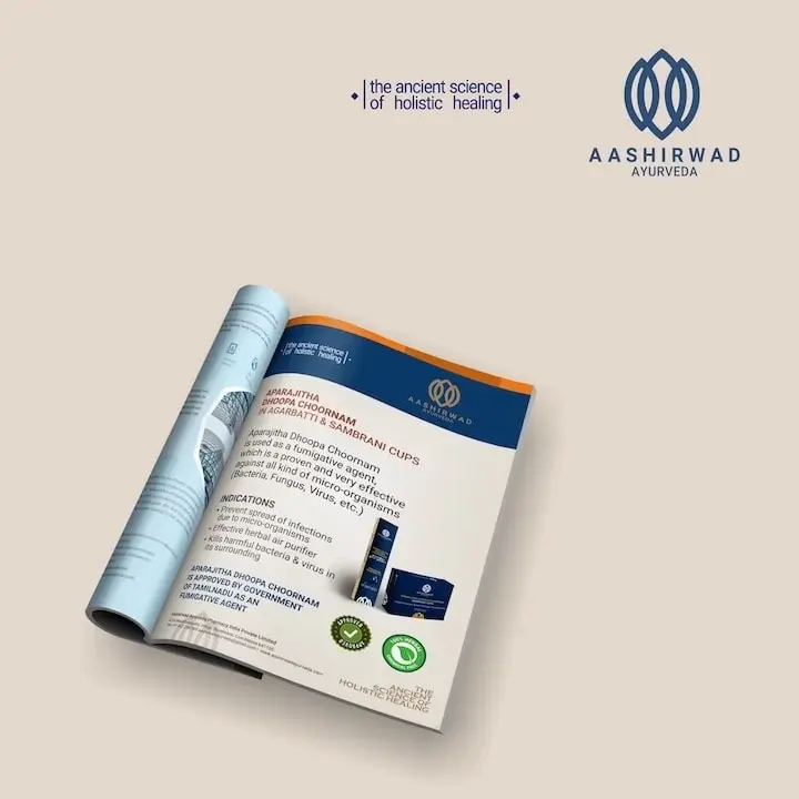
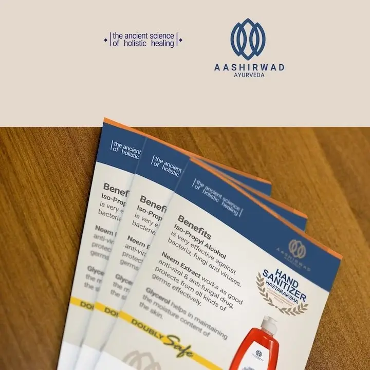
- Print Advertising
- Brand Implementation
- Corporate Documents
- Sub-brand Design (ORA)
“One mark drawn from doctrine - extended from a share certificate to a premium cosmetics line without losing its source.”
Ready when you are
Send us a brief.
We respond in 24 hours.
Complete the Discovery Workshop (guided steps built around the service you need) and our principal team will come back with a call slot, an honest assessment, and a clear first step. No standard pitch, no generic decks.
Discovery Workshop
Guided by service. Built for your brief.
Service-specific questions, not a generic enquiry form. Takes 5 to 10 minutes.
- 01
Pick your service
Logo, website, packaging, or implementation. Select one or more and the brief builds around exactly what you need.
- 02
Choose how to work together
A fixed-scope project or ongoing monthly support. One choice and the form adapts to your model.
- 03
Brief us on your business
Industry, style direction, competitors, and the specifics per service selected. The more detail, the sharper our response.
- 04
We reply within 24 hours
A call from our principal team, not a queue. An honest read of your brief and a clear first step forward.
Or email us directly at info@exposure.co.in